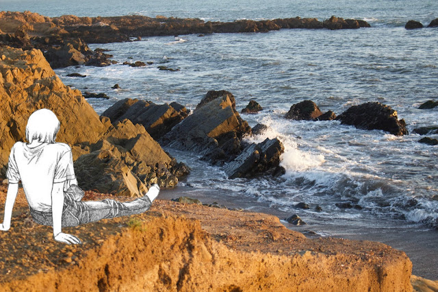
Throughout this project, I wanted to focus on contrasting the difference between drawings and reality. I thought that keeping the drawings black and white made allowed the real photo stand out more which abled me to show the contrast a lot more. These images are the one's I thought were the best ones from this entire project.
This week I really focused on erasing all the extra space from the drawing images that I didn't need. This I think is one of my most time consuming series I have ever done. I kinda mixed in the idea of imagination and reality into this draft. For next time, I think I wanna try both of them for a whole entire week to really get a sense of black and white realistic drawings in colored real backgrounds versus black and white imaginative drawings in colored real backrounds


Comments
Post a Comment