I felt that it was much harder to find images this week because I had already been around the Drew neighborhood the other weeks that it was difficult to find subjects that I hadn't used already. This week, I tried to use subjects that were more than just grafiti. This is included subjects that didn't contain any words in the image as well. I started to run out of ideas of what to take photos of, so I started taking pictures that seemed interesting to me, so some of the images that I posted might not seem completely out of their natural habitat. Some of the items that I wanted to take photos of were kind of out of my reach, so I tried to take the photo as well as I could, but some I feel like the angles are kind of off. However, I kind of like the feel of the strange angles because it allows the subject to stand out more.
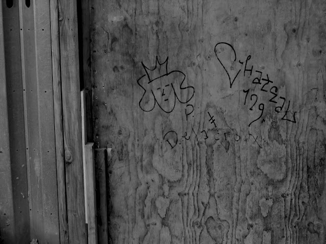




I love how each photo has a different type of graffiti or message. I thought this week was your strongest so far. keep up the good work!
ReplyDeleteI think this is such a cool project and I really like how each photo is so different yet they all work together really nicely. Your post flowed really well and I enjoyed how each photo was in black and white. you did a great job!
ReplyDeleteMy favorite is the second to last one; I think it best captures the Lyon-esque atmosphere. I also like how there's a bit of a floating or hanging motif here, like the hanging block and ornaments. Well done.
ReplyDeleteI really like the way the lights and darks are so contrasting because they add to the disjointed nature of your photos. You also took a lot of pictures of things that seem out of the ordinary like doorknobs with no door or a mattress on a tree rather than a bed-- these all add to the eery feeling Lyons tries to convey.
ReplyDeleteThese all look really cool! I really like the second image.
ReplyDeleteI really like that these photos not only show the city but also the not as nice parts of the city, which conveys a strong message, my suggestion is to rotate your photos if they are not straight.
ReplyDeleteI really like how your images tell story. I feel like behind each image is its own story. great work
ReplyDeleteI would agree that your odd angles add to the eeriness of you photos. My favorite one is your 6th one because it's so out of the ordinary for something to seem floating, although it's not. Great work!
ReplyDelete