
Class Portraits 2

This week we continued on our class portraits mimicking their different series.

Danny's series captured how athletes express their mood and emotion to the world and how they carry themselves. 


Daro imitated the photographer Jerry Uelsmann by combining different images to make one image.


I chose to do David's levitation series from his winter series

Lauren's fall series was to imitate the photographer John French who focused on making shapes with arms. 


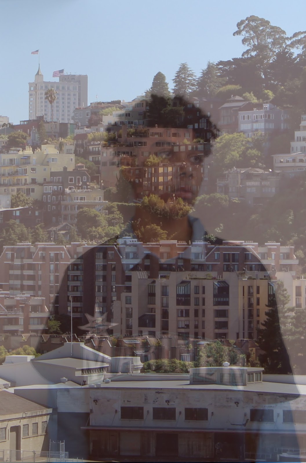
Liam's winter series was to imitate the photographer Jasper James who worked on city silhouettes. 

I imitated Max's winter series which was blurring the image to make shapes that are abstract

Stewarts winter series was to give his images and urban feel. 

Comments

  1. I think you did a wonderful job focusing on everyone's styles. Keep up the great work

    ReplyDelete
  2. I think you did a great job by editing each photos so that it imitates the artists style

    ReplyDelete
  3. Great work. Fantastic work on the overlay in Liam's image.

    ReplyDelete
  4. Fantastic work. My only suggestion would be to blur my image a bit more.

    ReplyDelete
  5. These are really good! You did a great job replicating everyones style.

    ReplyDelete

Post a Comment

Popular posts from this blog

Fall Series Draft #2

In this new draft, I realized that Jasper James' City Silhouettes were a bit brighter than what I had made them and that the photos of the people were all different sizes. Some of them were zoomed in while others were farther way. I started with the city as the background but I only edited it after I combined it with the picture of the person. This way, it allowed me to see how much the background need to brighten to make the picture of the perosn stand out more. 

Fall Series Final #4

In my last draft, I really got into the candid photos of my people. I think they really brought the photo together. As before, I used the city image as the background but I only edited it after I combined it with the picture of the person. This way, it allowed me to see how much the background need to be brightened to make the picture of the person stand out more. In these photos I really wanted to make sure that it wasn't just the person being seen, but there was some notice of the background. However I wanted the main focus to be the models and I think that the bright colors that my model were wearing allowed them to stand out of the photo allowed most of the focus go to the model. 

Design Cover

I think this week was one of the most difficult assignments so far. It took me a really long time for me to find covers that I could make. Not only that, it was also a really hard to find the right fonts and images to replicate covers so they looked very similar. This project was very time consuming but it was really fun to do.