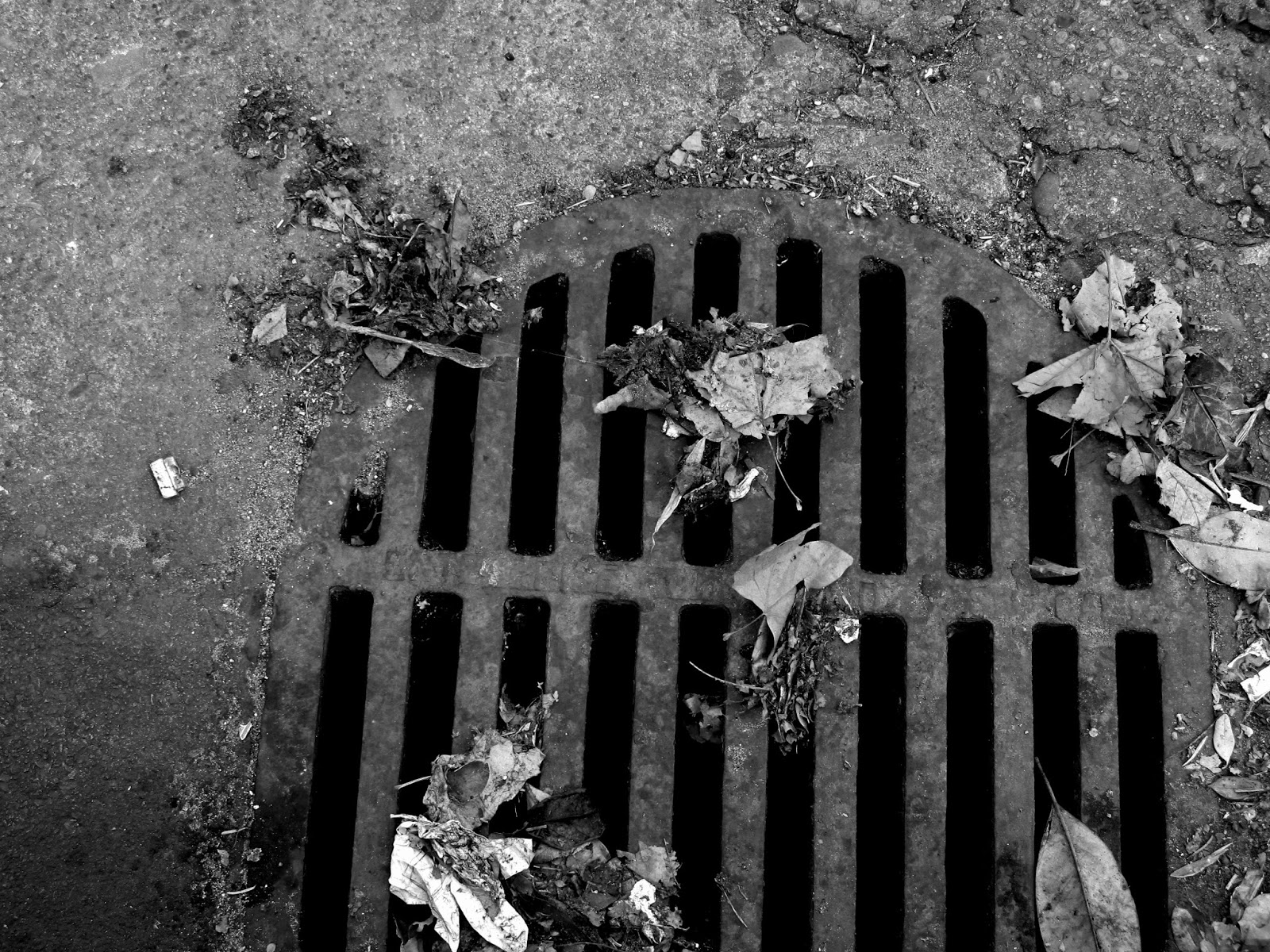
This semester I chose to replicate the photographer Nathan Lyons. He is known for his honest and often questioning depictios of America's cultural landscape. He decises sequences of black and whate picutres that incorporate graffiti and advertisement in order to explore the use of language in images. As I was editting, I wanted to make sure the contrast of the black and white brought together the meaning of the photo but at the same time resembled the likeness of Lyons images. Because Lyons focuses on images that stand out of their natural habitat, it was hard finding subjects that matched that topic so I tried to make it seem like they were out of their natural habitat.




I think you did a really great job producing images that were unique and made your post flow very nicely. I also really enjoyed how you had all your images in black and white. Great Job!
ReplyDeleteI really like the photos of your murals, my suggestion is to either go with happy or sad with the tone you are trying to convey.
ReplyDeleteI love this. Keep doing what you're doing, involving the subjects of graffiti and simpler text that you find on the street. I really like the "PLEASE DO NOT BLOCK" one because of its minimalist composition; it adds some more diversity to the series. Amazing work!
ReplyDeleteI really like these photos because there is a sense of disconnect between all of them. You chose really good subjects to convey Lyons' work. Keep doing more minimalist photos (like your sixth and thirteenth photos) because these show off the composition best.
ReplyDeleteThese photos are really great! They are so sharp and the editing is so strong. I think your doing a great job, and I'm excited to see what you do next..
ReplyDeleteI like how you had a variety of photos with different moods associated with each. Keep it up
ReplyDeleteI really like your photos and how your tied all of your photos together with an eerie vibe. While I was studying Nathan Lyons, I discovered that he never had any people in his photos in order to contribute to the eeriness. My only suggestion would be to take less photos of people. Other than that, great work!
ReplyDelete